If you ever watch a golfer playing a bunker shot, you will see him start by doing a sort of shuffle in the sand to anchor his stance
– the club head must not touch the sand lest it moves the ball, so the stance is even more important.This shuffling-in gets the player into the feel of the shot too. He then takes a few practice swings, all the while getting into that shot. Likewise, you can tell a good hairdresser (a proper cutter) by the sound of the moving clicks of the scissors when not cutting, the hands mimic the actions and feel their way around the hair before committing to the correct cut. This tuning in to the activity happens in all sorts of disciplines.
I remember seeing a film of Matisse painting; watching the brush likewise twitch, weighing up the mark, hovering then committing to the stroke…like the hairdresser, like the golfer. Painting is such a physical medium; the paint needs controlling, surfaces have to be created, colour orchestrated, space opened, light generated.
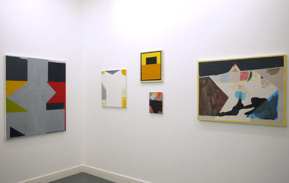
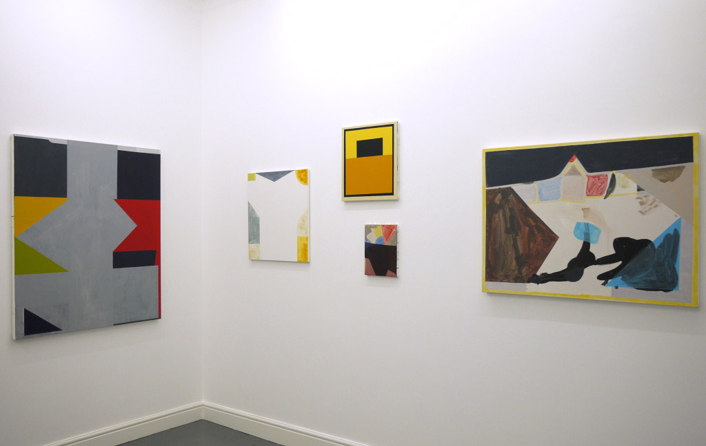
In knowing David Webb’s paintings and having seen his current one person show at dalla Rosa Gallery, Clerkenwell, London, I can see many of these painterly qualities and such a tuning approach. This gradual honing in to an essential colour, the unearthing of a surface, the finding of a shape. Any element in any of his paintings is weighed up, considered and arrived at rather than simply painted in. Webb is a visually intelligent artist and enjoys using paint in a variety of ways: from watercolour stains of delightful delicacy to sandy textured, muted colour that feel like a sun drenched exotic wall or to a leaden, matt, almost gunmetal grey – flat as a pancake but animated by a pleasing curviness of shape.
This is a modest show of new works, mainly acrylic on canvas with a paper piece (one of the stronger works) behind glass. Most of the works under an arm’s span; the majority inside the shoulder’s reach. There is one large work of which I will return to. Of late, linear elements have found their way into his paintings adding a welcome scale shift and also a surprise texture when you notice they are often drawn in charcoal. These lines echo or declare edge, their extremities sometimes turning at their end in gentle arcs to prevent a rigidity setting in. One would be mistaken also for thinking the internal colour edges are taped, as upon closer inspection it seems that they are hand-wrought. Even a relatively small section of saturated colour seems hard won, almost laboriously applied in stages with smaller floods of colour, which eventually reach the limits of the shape. Pliability is much in evidence. This is clearly a person who loves to paint.
A good friend of mine from America once said to me “never fall in love with your car or your house!” To that I would add “or your painting.” Sometimes I sensed Webb flirting a bit with some of the works, when a colder eye may have demanded a tiny bit more from the colour’s intensity and a little less from the application. Grey is used often to key in the primaries – all nicely pitched. Webb uses darks and lights extremely well too, with black or deep greys against creams, beiges and washed out colour – often a particularly memorable yellow appears. All of these qualities are evident in a work like Parcheesi (twist grey) with the split stacking being interrupted by the angular intrusion of washy blue grey. This is a contemplative work with quite puzzling spatial shifts.
The largest work, Tourist Smoking Room I felt was more of a statement of intent than a resolved whole, in the way that many of the other works were. Working on this larger size is something that needs a slightly different strategy in dealing with the “blank” areas which were a little stark – maybe more evidence of that “shuffle” and a change of, or more than one, neutral colour to talk to the elements’ colours more? The turquoise smudge at the base being an attempt to soften the abruptness and a tiny flick of paint occupying the void between the tall dark handsome, yet peculiar form on the right and the parrot-like image to the centre. These devices work on smaller sizes and the paintings are peppered with subtle adjustments to corner, edge and area, but sometimes subtlety is not always the best policy.
I enjoyed this show for all the qualities that I have mentioned: the sensitivity, the colour juxtapositions, the delicate surfaces, but – dare I say – I believe Webb would reap even greater rewards if the subject matter was removed and he went off piste more. All these qualities of paint handling would also be put to the test and greater demands placed upon them and a deeper synthesis could be achieved. Unnerving, undiscovered spaces may well reveal themselves.
For myself, I prefer to see the subject up front – if there is one, rather than discover it; subject matter can lock in the experience of the colour – like travelling on train tracks instead of hiking on an open road. JP in Mexico is a case in point, with its refreshing, bang, there’s the landscape feel, whereas some of the other works often had a tantalising opening up into the abstract held in check by a sense of the local. (This being the modus operandi though granted.) Webb is widely travelled and uses these recces into other country’s geographies, climates and cultures to inspire his work. Plenty in the tank then to go for it from scratch maybe? As Tennyson said, “I am part of all that I have met, yet all experience is an arch wherethrough gleams that untravelled world whose margin fades forever when I move.”
In fairness though, this is not a claimed as a show of abstract painting per se, rather one of covert figuration with pared down forms, sections and passages, which are informed by landscapes, both viewed and remembered. Many of these places have an intensely personal resonance, adding a poetry to the raison d’être of the exhibition. I would hasten to add though, whereas this may be significant to a viewer, it is not to a viewing. Subject matter can be a bit like the trap to a greyhound, framing its view of the situation; yet once the race starts, the dog has left it behind…

